Reviewing Official Ditto Art
There comes a point in collecting items for any given character (especially within a franchise with hundreds of other characters) when you notice the sheer repetition of artworks used on merch. So I thought I might give a go at documenting the official Ditto art used on merch and giving a subjective opinion on it! :)
As with much else on this site, this will remain an on-going project for a bit, I imagine. I'll aim to be as concrete with dates/etc but some things might be a little fuzzy (so do not use this as a final source!)... Still, I'll try!

|
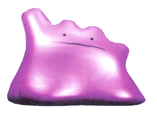
Artist: Ken Sugimori
First Known Merch: Batomen Chip Year: September 1996 art courtesy of pokemondb |
|
This is it, the original (well, kinda... more on that later) Ditto art! For that alone, we must give it a lot of credit, even though it's not particularly interesting, is it? On the positive, Ken Sugimori's original art is literally iconic, with the ink and watercolors; it's truly gorgeous! I'm fascinated by where the highlights are.
On the negative, I hate that Ditto looks so perturbed here... And we must be honest, this art reigns supreme for Ditto merch from the very first one. It took over a year for any other art to join it! So for as nice as it truly is, I must allow I suffer exposure fatigue with it, especially with much of the early merch... For better or worse, it will be a baseline middle ground to which all other official Ditto art will be compared. |
|
|
Rating:  |
|


|
Artist: Motofumi Fujiwara(?)
First Known Merch: Carddass Parts 1 & 2 Year: October 1996 art courtesy of me |
|
Look at this lil guy! While this pixel art was meant for the Red/Green video games, it was showcased much earlier on the backs of Parts 1 & 2 of the Carddass sets.
I've not seen this used on any other merch, which isn't the worst thing. In the end, it's pleasant looking (though I'm not the biggest fan of the prominent eye horns). I do think they made the correct decision when they redid the art for Blue version. Fun fact: this pixel art is actually the first official art of Ditto! The GameFreak design team made the game sprites for Red/Green and Ken Sugimori made his famous interpretations off of them afterwards. In the game proper, the sprite is actually flipped, from which the Sugimori art is oriented! |
|
|
Rating: |
|

|
Artist: Unknown
First Known Merch: Christmas Postcard Year: 1998 art courtesy of me |
| This one is a tiny, blocky lil guy! It makes me think of Green's Ditto from the Pokémon Adventures manga; the style is decently close. You could argue it's not a very special or interesting piece (which is very true, but when combined with the rest of the art, I'm hooked). Besides, I must admit I'm pretty biased to artwork that only makes a couple of appearances, and I only know of two areas this Ditto art appears! You could also argue that with such a blocky shape, it explicitly goes against my demands for a goopy Ditto. Well, what can I say? I contain biased and heavily subjective multitudes. | |
|
Rating: |
|

|
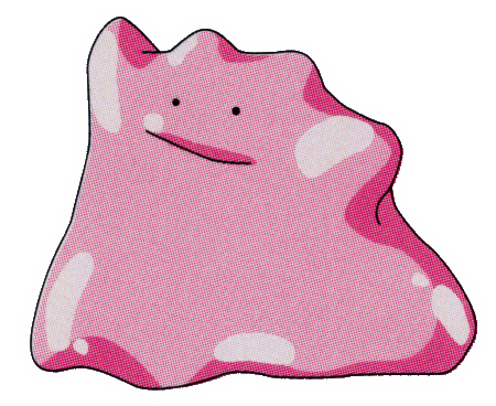
Artist: Unknown
First Known Merch: Year: 1996 art courtesy of vcorbi, TheHugeUje, and Eduardo Lagos |
|
Oh, baby, this is the good stuff!!!! Parts 3 and 4 of the Carddass sets are chock-ful of perfect art that... is never used anywhere else. Still, it means my enjoyment for it doesn't get dampered by oversaturation. Win/Win!
This is just great. Ditto showcases its two primary traits: its goopy nature and its transformation ability. I'm in love with it's blocky squiggle mouth, as well as the size of that beak on Charmander. Just perfection. I can't overstate that! This is the ideal all Ditto art should strive for!! |
|
|
Rating: 
|
|
|
Artist: Keiji Kinebuchi
First Known Merch: Pokémon TCG: Fossil Deck Year: June 21, 1997 art courtesy of me |
| I have a confession... I don't think I've found a single 3D model of Ditto that warrants more than a 2 out of 5. The constraints, especially of mid-90's CGI, are such that it's just impossible to properly render the joyful aspects that make Ditto, Ditto. And this incarnation isn't helped by being a 1:1 to Sugimori's original art, which is already greatly over-used in merch... It's not the worst that has come out over the years (we'll get to that one later!), but I can't rate it any higher than this. | |
|
Rating: |
|

|
Artist: Ken Sugimori
First Known Merch: Pokémon Stamp: Blue Version Set Year: mid-1997 art courtesy of pokemondb |
| Here it is, the second big Ditto art! This one is a massive improvement over the first, with a much more pleasant vibe. Ditto is goopy and happy about it! Of all the art that gets re-used over and over, this one is easily the best. If it's use weren't so saturated, I'd rank it higher. | |
|
Rating: |
|
|
Artist: Unknown
First Known Merch: Batomen Chip Year: 1997 art courtesy of bulbagarden |
| Our first anime art! Based on Ken Sugimori's original work, this is likely pulled from the character model sheets (settei) made for the anime. It first appeared on several 1997 items, and is mostly uninteresting, especially compared to the original. It's not bad by any means, but it's not got much else going for it. | |
|
Rating: |
|
|
Artist: Unknown
First Known Merch: Televi-kun Menko Year: May 1998 art courtesy of me |
| Another one (likely) pulled from the anime character model sheets (settei). It's better than the previous one, though maybe that's thanks to it being a bit less flat looking and that it isn't used nearly as much as previous art. Interestingly, this art seems to be used more for the American merch, though I can't say why that is... In any case, it's a perfectly serviceable piece of art that is more interesting solely because of its relative under-use on merch. | |
|
Rating: |
|